Branding
Art Direction
Render Legible: Mock Design Convention
Connecting digital and physical experiences through system design. Developed for a mock convention, Render Legible features a unified design system that scales seamlessly from a responsive website to event collateral like passes and merchandise.


Goal
Create a cohesive, omnichannel event identity for the Render Legible design convention that seamlessly bridges the digital and physical experience, ensuring a unified brand journey
problem
‘Render Legible’ needed a visual language that actively told the convention's story while connecting audience attention and understanding.
Work Timeline
Four weeks as part of the TXST University Course, ARTC 3320. Typography II.
tools
Adobe Indesign · Adobe Illustrator · Figma
Design System
01
Visual Storytelling
Render Legible is a public convention event that is centered around the theme of human design and craftsmanship as they move through modern digital spaces.
I built this patten from manipulated typography. By distorting, layering, and abstracting type the composition resembles digital noise. This pattern is meant to represent the transformation of human reality as it moves through machine interpretation, staying true to the conventions theming.

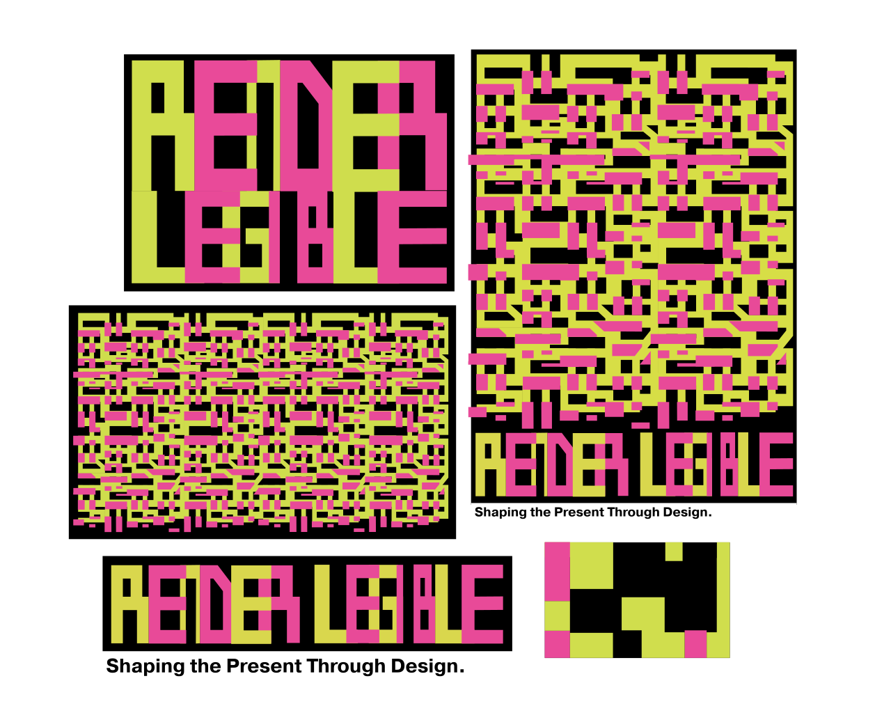

The typeface 'Ahnsangsoo' is a three set, de-squared typeface designed by Ahn Sang-Soo in 1985. Each character is composed of geometric forms for enhanced legibility, a nod to the events title.

The typeface 'Ahnsangsoo' is a three set, de-squared typeface designed by Ahn Sang-Soo in 1985. Each character is composed of geometric forms for enhanced legibility, a nod to the events title.
The typeface 'Ahnsangsoo' is a three set, de-squared typeface designed by Ahn Sang-Soo in 1985. Each character is composed of geometric forms for enhanced legibility, a nod to the events title.
The typeface 'Ahnsangsoo' is a three set, de-squared typeface designed by Ahn Sang-Soo in 1985. Each character is composed of geometric forms for enhanced legibility, a nod to the events title.
02
Digital Developments
The events landing page was created to resemble the digital noise pattern with the use of varying columns and rows. The CTA "Join the Noise" is also a further reflection of the aesthetic.
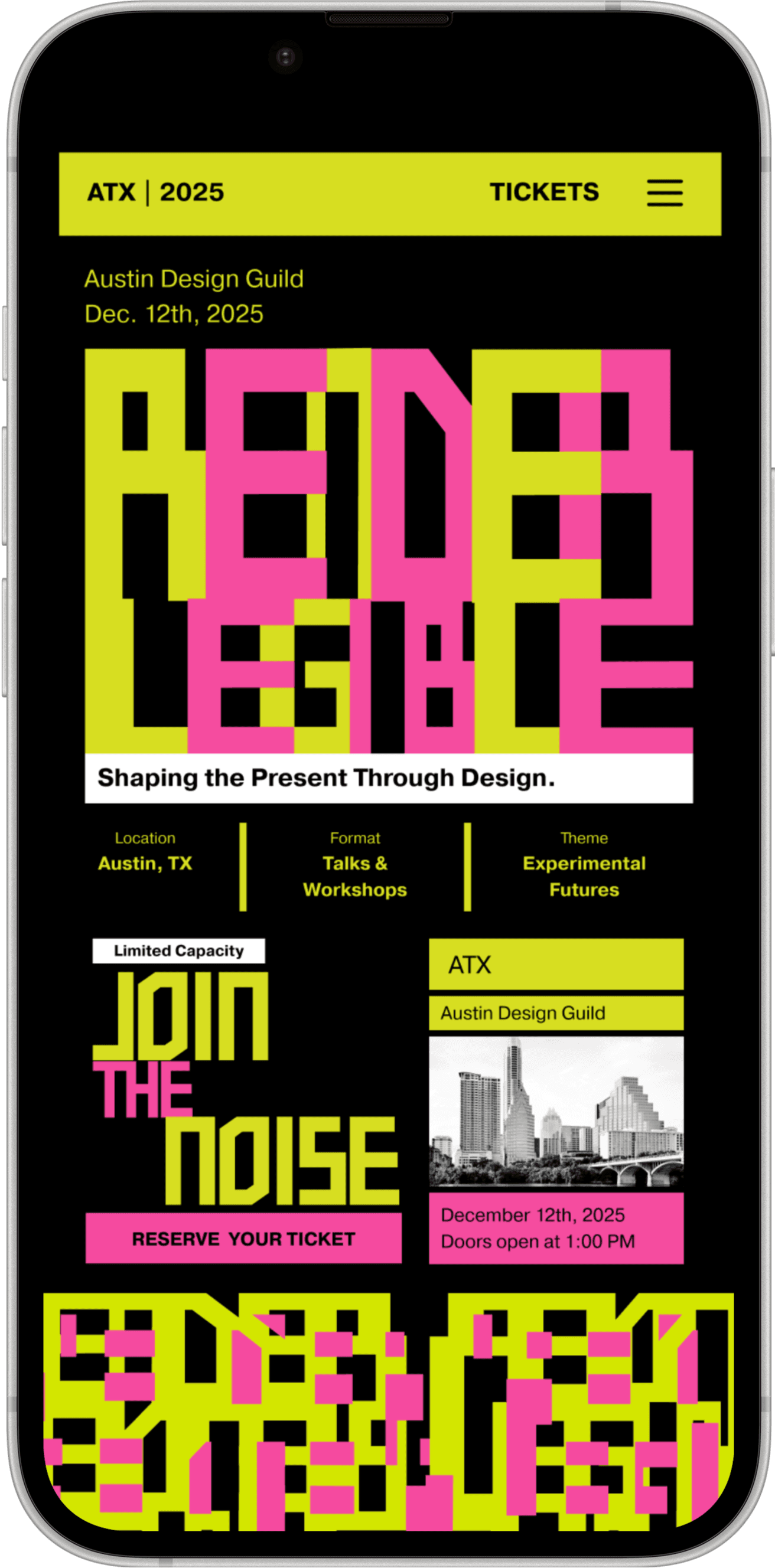

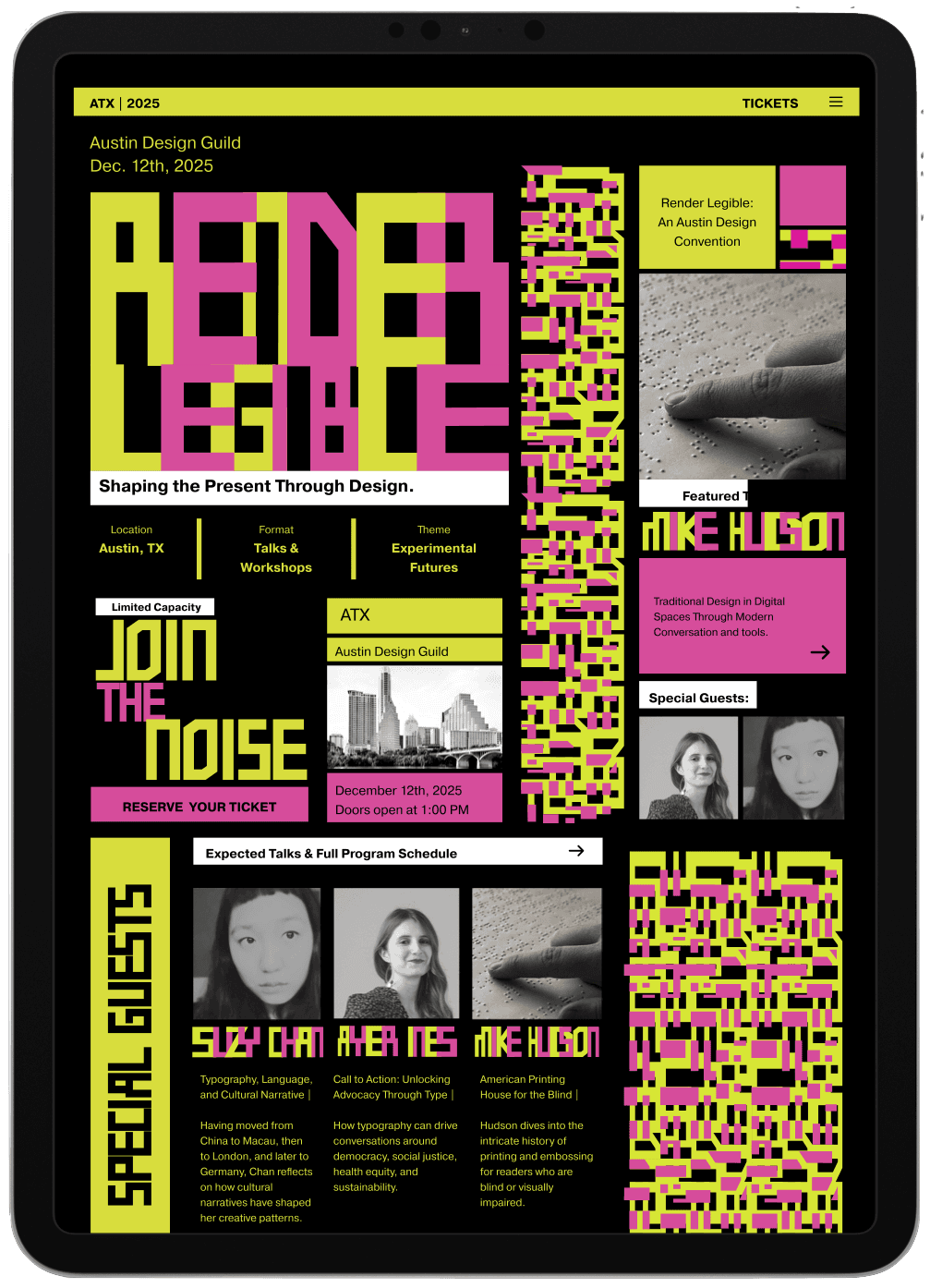
The typeface 'Ahnsangsoo' is a three set, de-squared typeface designed by Ahn Sang-Soo in 1985. Each character is composed of geometric forms for enhanced legibility, a nod to the events title.
Brand INtegration


Brand INtegration
takeaways
Through building a consistent language of typography, pattern, color, and digital texture, I learned how intentional systems can communicate complex concepts while remaining adaptable across multiple applications. Moving forward, this project has deepened my interest in creating scalable visual identities that balance experimentation with consistency, allowing designs to feel both expressive and unified.
takeaways
Through building a consistent language of typography, pattern, color, and digital texture, I learned how intentional systems can communicate complex concepts while remaining adaptable across multiple applications. Moving forward, this project has deepened my interest in creating scalable visual identities that balance experimentation with consistency, allowing designs to feel both expressive and unified.
Branding
Art Direction
Render Legible: Mock Design Convention
Connecting digital and physical experiences through system design. Developed for a mock convention, Render Legible features a unified design system that scales seamlessly from a responsive website to event collateral like passes and merchandise.
Goal
Create a cohesive, omnichannel event identity for the Render Legible design convention that seamlessly bridges the digital and physical experience, ensuring a unified brand journey
problem
‘Render Legible’ needed a visual language that actively told the convention's story while connecting audience attention and understanding.
Work Timeline
Four weeks as part of the TXST University Course, ARTC 3320. Typography II.
tools
Adobe Indesign · Adobe Illustrator · Figma
01
Visual Storytelling
Render Legible is a public convention event that is centered around the theme of human design and craftsmanship as they move through modern digital spaces.
I built this patten from manipulated typography. By distorting, layering, and abstracting type the composition resembles digital noise. This pattern is meant to represent the transformation of human reality as it moves through machine interpretation, staying true to the conventions theming.
The typeface 'Ahnsangsoo' is a three set, de-squared typeface designed by Ahn Sang-Soo in 1985. Each character is composed of geometric forms for enhanced legibility, a nod to the events title.
02
Digital Developments
The events landing page was created to resemble the digital noise pattern with the use of varying columns and rows. The CTA "Join the Noise" is also a further reflection of the aesthetic.
Brand INtegration
takeaways
Through building a consistent language of typography, pattern, color, and digital texture, I learned how intentional systems can communicate complex concepts while remaining adaptable across multiple applications. Moving forward, this project has deepened my interest in creating scalable visual identities that balance experimentation with consistency, allowing designs to feel both expressive and unified.